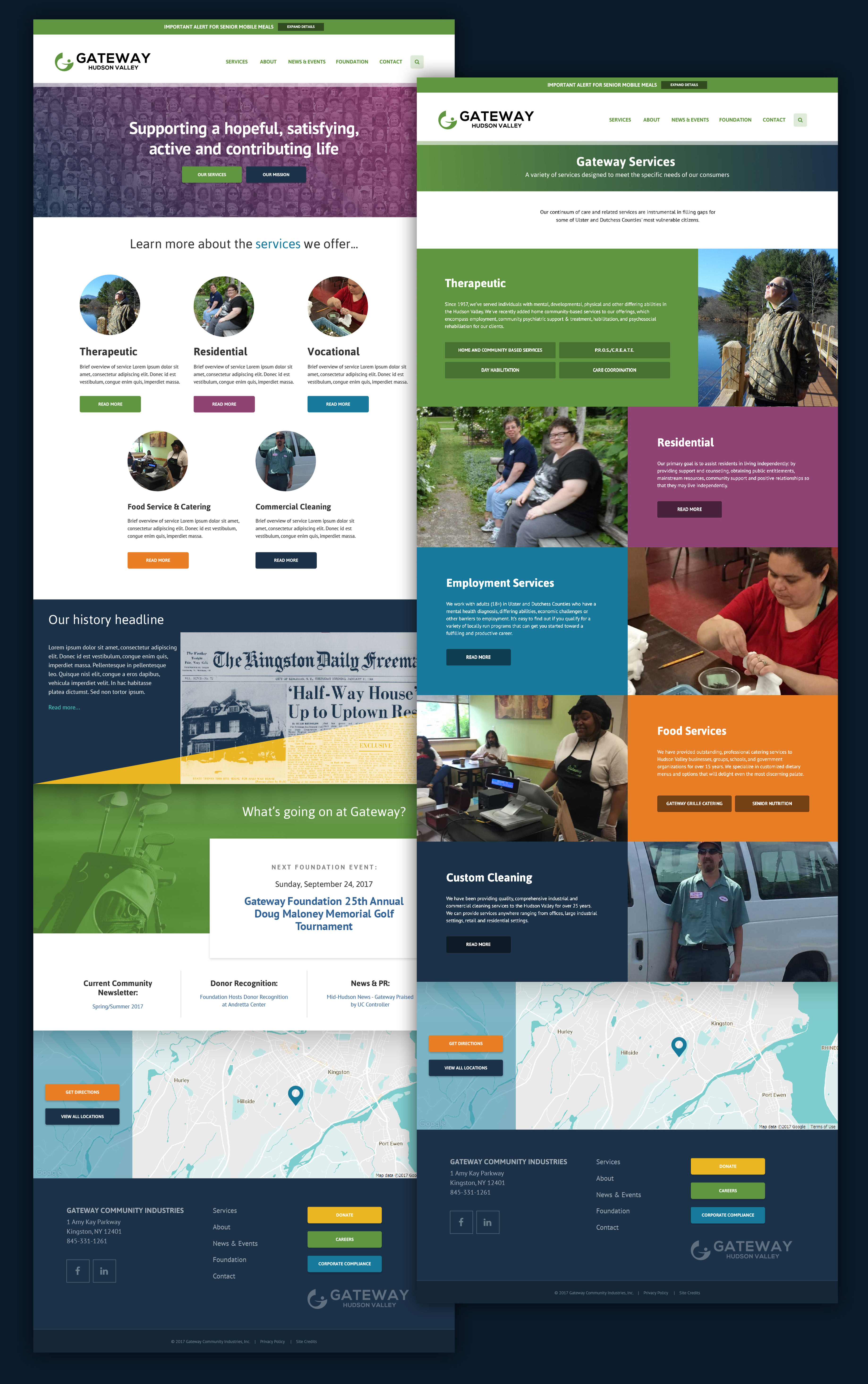
Services
Website
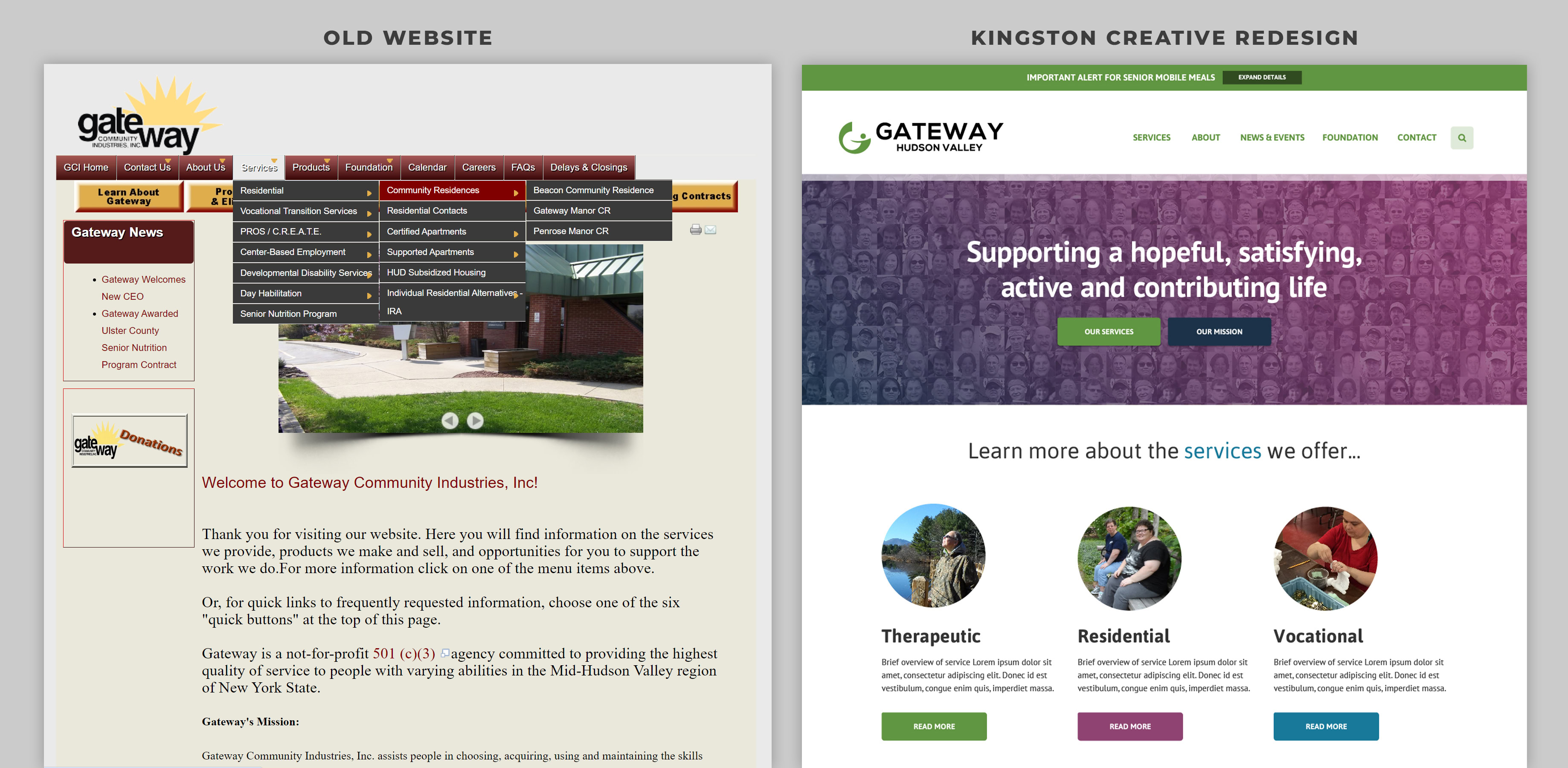
For over 60 years, Gateway’s leadership and staff have stayed laser-focused on serving the community in a wide variety of ways. However, their existing website was stretched far beyond its original purpose, and the dense maze of existing and conflicting content was turning into an impediment for community members who wanted to take advantage of Gateway’s services.
They needed a website that would make it easier for Gateway to serve its many different stakeholders.
A Complete Overhaul for an Outdated Website
It is not an exaggeration to say that Gateway’s original website had become labyrinthian, with nested menus upon menus of overlapping services. Our website design process re-organized and consolidated dozens of pages into an intuitive, color-coded system. We’ll show you how below.
Discovery
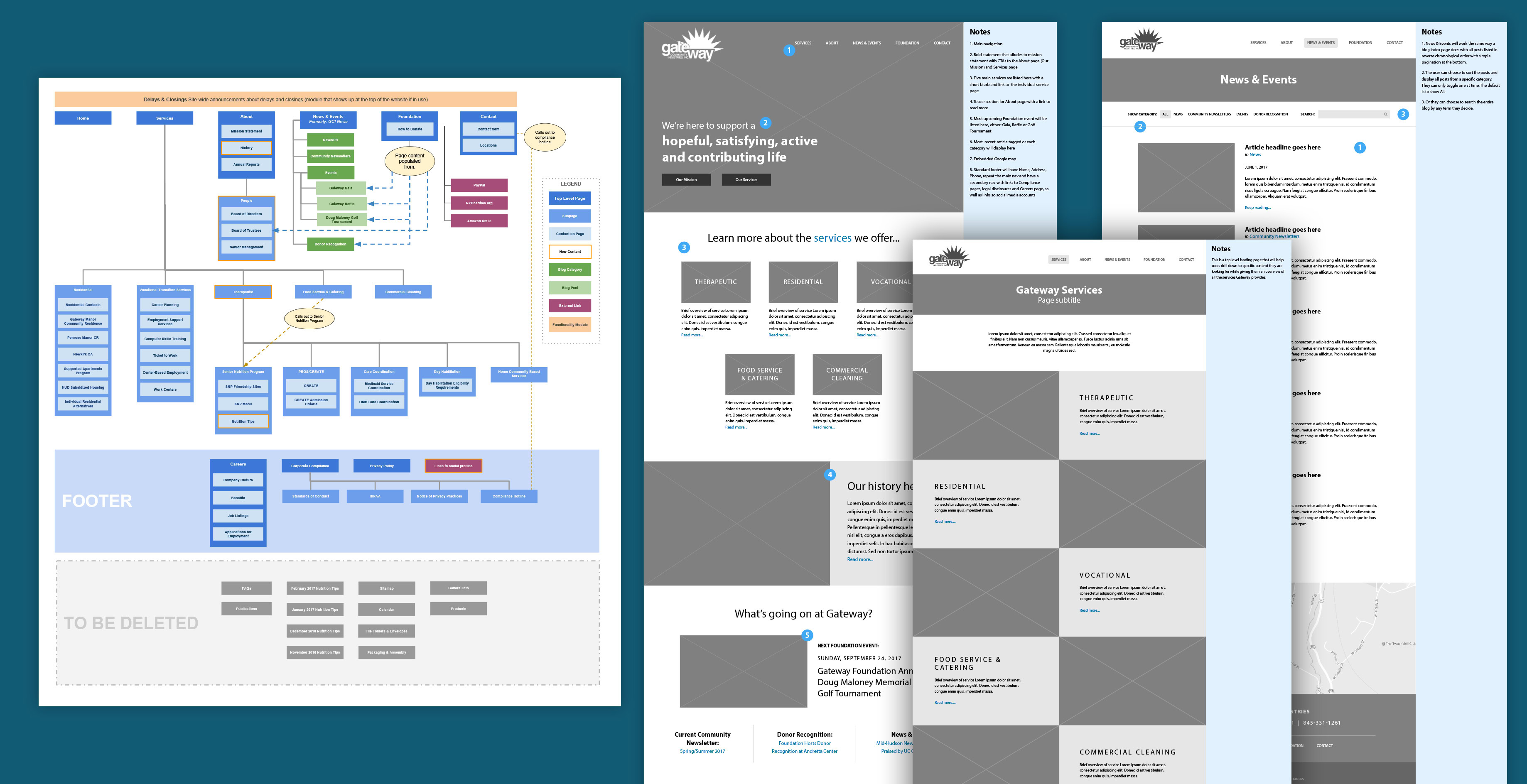
For big website redesign projects like this, the most critical part of the process is sitemapping and wireframing. Sitemapping creates a visual inventory of a website’s pages and how they’ll be organized, while considering the unique pathways and needs of different kinds of users. This foundational DNA endures for years, even if the website cosmetically changes over time.
After receiving valuable feedback from the client, we then proceeded with wireframing, giving great thought and consideration to where we know users and stakeholders will not only be looking for information, but could be informed about new initiatives, events and deadlines that they weren’t aware of.
Creating a visual schematic
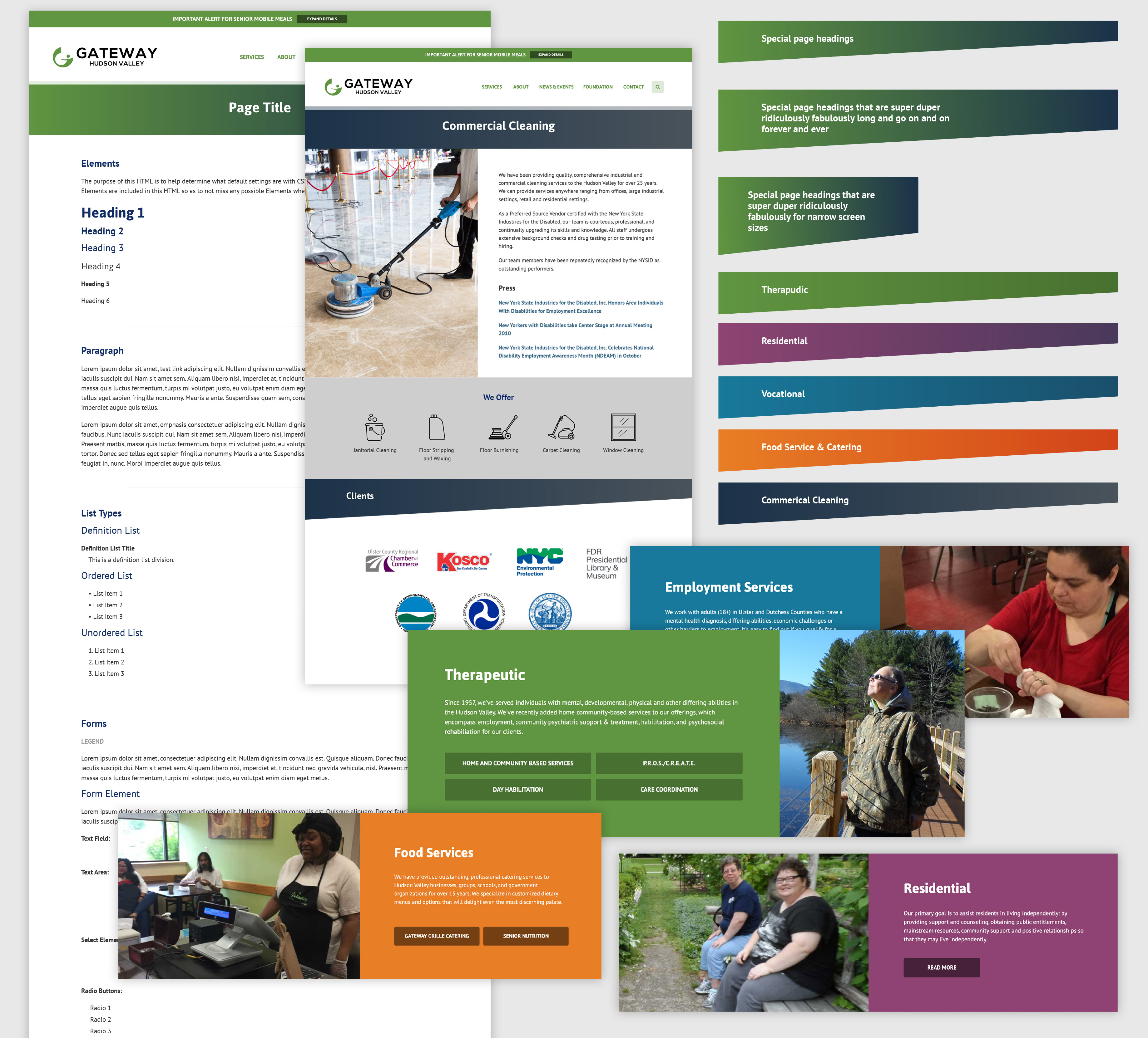
After integrating feedback from Gateway’s team, we then designed the site to have an visually color-coded organization system that is still in use today. The five main categories of services that Gateway offers are grouped by color, offering a sharp contrast to the free-for-all that existed before. Finally, using photos provided by the client, we built the site in WordPress, the most popular content management system that offers great flexibility for future changes.
Responsive Web Design
Once we reorganized all content and agreed on the different audiences for the site, we proceeded to the design process. We used industry-standard accessibility practices to ensure that all of Gateway’s stakeholders would be able to navigate the site, using big, easy-to-read buttons and high-contrast colors. Additionally, each service line has its own color-coordination scheme, making it extra clear to users when they’re in a “Residential” vs. “Therapeutic” area of the site. We also used as many photos of real Gateway clients and employees as possible.
